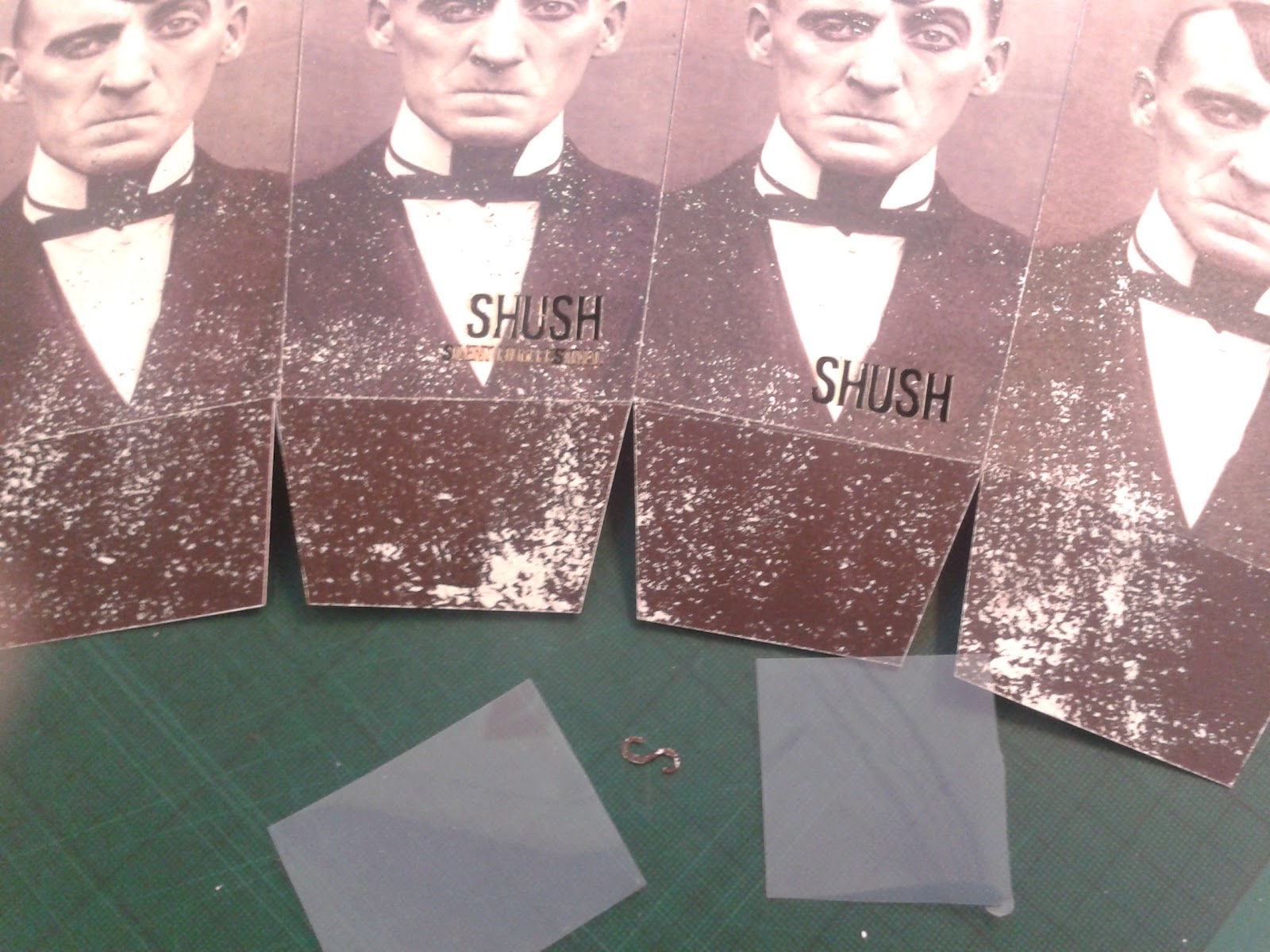
The print didn't come too well and some ink was patchy but it kind of added to the old look but still would have looked better as a clean print. I laser cut the festival name out of this and placed accetate behind to show the popcorn inside of the box and to keep the idea of removed type.
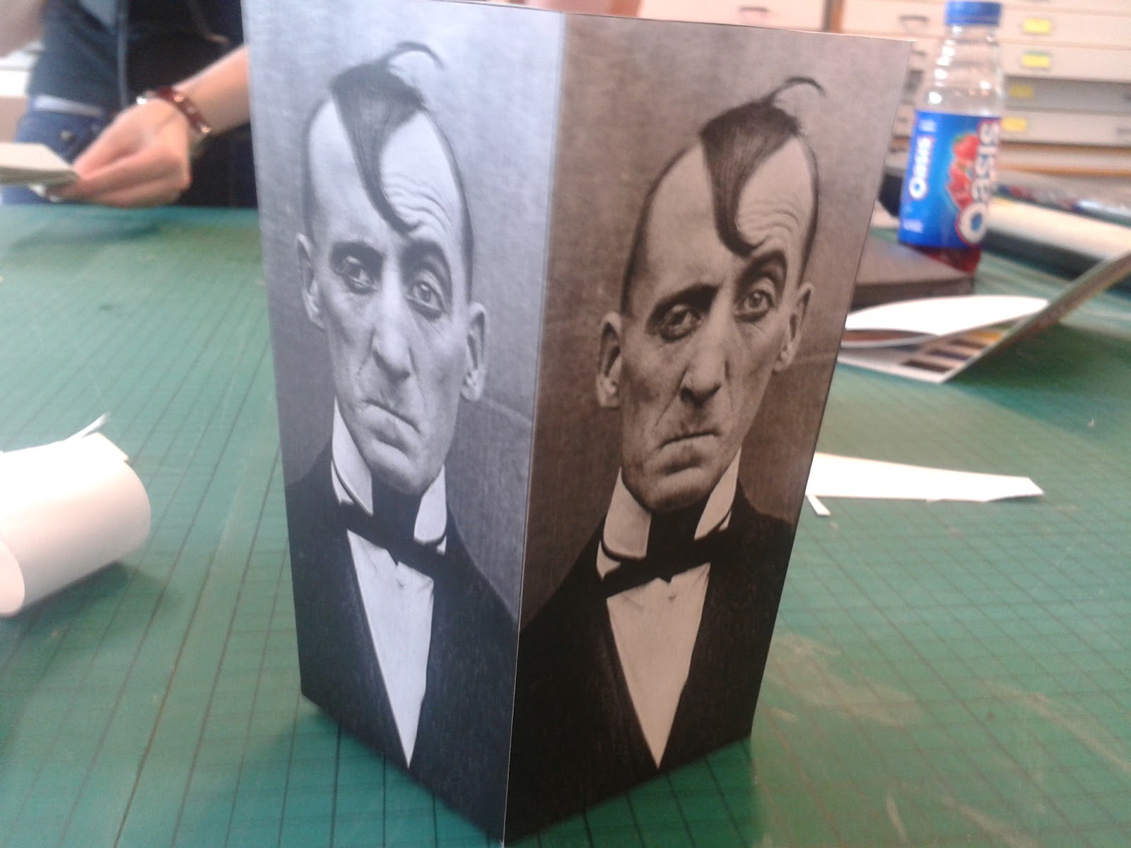
I created a sweet and a salt package with the photos I believe best represented this.


No comments:
Post a Comment