We had our first meeting today with Steve from Interior Design. We went with a list of quesitons and things we wanted to know.
Number of students
Images of students or not
Sections/chapters/pathways
We found out initial things we needed to know and also got some feedback from Steve things that he likes , both Graphic design and Interior design so that we could look into it and possibly influence our design.
We found out that he didn't like last years colour for the yearbook. Also last years was very thing with roughly 30 pages, we want to make it more substantial as this year is focusing on 3rd year only and last year was an overview of all 3 years and not really a year book about the students as such. Steve also mentinoed that this book is an advertisement of the course as well as a year book.
We actually liked the colour but for copy inside it isn't really suitable but does make a unique, stand out cover. They've used this colour within the images as duotone images as well as black and white images. They have used a simple thin line throughout the layout which brings a clinical, clean style to it.
Tuesday, 31 January 2012
Fashion identity Robert Geller
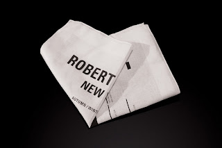
I came across this Studio in New York in a book I was looking at, they are called Newwork. I love all of their stuff and they have some particular identity and promotion work for fashion which I really like and is inspiring for my fashion branding brief.
I really like the simplicity of the black and white, this is one thing that Anna mentioned she wanted and liked, I think it represents style well and sophistication, its cool and quite contemporary which her designs are.
I like how they've produced many variations of one thing, like invitations and look books, subtle changes but gives more of a variety and adds more to the range.
The designs are so simplistic but create a distint identiy for the designer and show what he's about.
Monday, 30 January 2012
Fashion collaboration
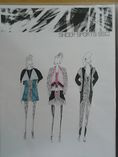
I'm collaborating with a 3rd year Fashion student, Anna Moutafis, for my third brief so we arranged to meet so that I could have a look at her work and get a background on what she does etc.
I took some photos so I can get some visuals to work from and research further to get some inspiration.
I've got a good idea of her style and the kind of work she does now and am excited to take it further.
We discussed the kind of thing she wanted and talked about a modern, urban, possibly monochrome style with subtle colour.
This is her colour palette for the last brief and we talked about using black and white, it being quite urban but maybe with a hint of colour.
It was good to see a strong concept behind her ideas because this is what I want to have in her branding,a strong concept throughout the look book etc.
We talked about panelling and how this could be a concept for the look book as well as layers and overlaying so I got quite excited on the first meeting about things I could do.
We also discussed a brand name and Anna at the minute is thinking of just using her name for the brand and then having a name for the collection.
Wednesday, 25 January 2012
Exhibitions
A catalogue or exhibition guide is definitely an important element of the exhibition material, carrying the identity through to print and onto all formats, giving more information about the work in the exhibition.
Subscribe to:
Posts (Atom)


