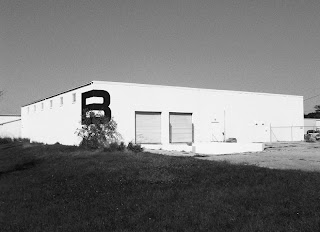
The identity is based on the board’s special feature, the edge, and the brand comes to life using the edge in any any application. A simple, structured logo is used in combination with textured and environmentally friendly stocks.
I really like the simplicity of the concept this is what I want to achieve in my work, simple, effective concepts that work so well.I also like the monochrome colour palette, it brings a sense of style and quality to the brand.


No comments:
Post a Comment