We want the cover to be embossed so it is subtle and reflects the sustainable nature of the course
Showing posts with label BRIEF 1 year book. Show all posts
Showing posts with label BRIEF 1 year book. Show all posts
Thursday, 10 May 2012
Mock up
We combined our designs together to create an up to date mock up of where we are with the year book. There are still images missing from two students and also some other information throughout.
We want the cover to be embossed so it is subtle and reflects the sustainable nature of the course
We want the cover to be embossed so it is subtle and reflects the sustainable nature of the course
My spreads


Wednesday, 2 May 2012
Putting it together
Now that we are starting to get the images through from the students Hazel and I have been working on putting the first profiles together.

 I started to insert the informaation of the students and work how to place the images according to the layout we decided on.
 This is one of the images we took when we went over to their studio to take photos of them in their working environment. I've desaturated the image and scaled it so it is full bleed. I'm not sure yet if it is looking too serious and dark but when we get together as a group I'll get some feedback. I also added the copy 'course showcase 2012' this is an introduction to the student profiles which follow.
 Some images are proving quite diffuicult to work with because of their size and shape butby experimenting with the order it'll come together.

Sunday, 22 April 2012
Interior Design- studio photos
These are a selection of the photos that we took, we took out a wide angled lense to capture the space. These are the best images we mamanged to get of the students in their environment and with the tutors. We're not sure yet which ones we want to use or how many but it allows to have options.


Year book- photographs and type


Saturday, 31 March 2012
Wide angled photography


Tuesday, 6 March 2012
Meeting 3
From last weeks meeting we went away and rethought the layouts and tried to combine the two which they liked.
This did prove to be quite difficult as they were very different, mine very busy and full and Hazels the opposite.
On the other side of the large full bleed image I tried to incorporate some of the elements Hazel had used which they liked. I also tried keeping mine consistent with blocks of colour behind the copy.
We talked about the use of orange last week and using it subtly so I have incorporated this into the numbers and also some titles.
 Last week we talked about the use of small dots like on the Ben Kelly website. I've created a quick page of dots in black and also a similar orange to give the idea of what they could look like and possibly be used on the inside of the front and back covers or to break up sections in the book.
All of our ideas for today:
Today's feedback:
They are creating a stand for their exhibition to showcase the books made out of wood. So a sustainable, brown/woodllike cover would be unsuitable with regards to standing out. A colour or white would be better.
They definitely don't want an image on the front, text or quite. We talked about embossing as a sustainable option for the cover.
Using a variation of layouts to break it up and so it doesn't become repetitive, out of the layouts we showed them they picked a few they like best which we can go away and work with to create a consistency. We need something which can tie the whole thing together, we are thinking the dots running throughout.
Possibly feature pages to showcase more work as last week they were talking about giving some people 4 pages and some 2 which isn't fair, this way more work can be showed in groups of images.
Using the numbers in orange.
Wednesday and thurday we can take photos.
23rd April- image deadline
12th May Print
Feature pages:
Technical
Perspective
Model Making
Sustainability
Trips/Visits
London, Berlin
On the other side of the large full bleed image I tried to incorporate some of the elements Hazel had used which they liked. I also tried keeping mine consistent with blocks of colour behind the copy.

All of our ideas for today:
Today's feedback:
They are creating a stand for their exhibition to showcase the books made out of wood. So a sustainable, brown/woodllike cover would be unsuitable with regards to standing out. A colour or white would be better.
They definitely don't want an image on the front, text or quite. We talked about embossing as a sustainable option for the cover.
Using a variation of layouts to break it up and so it doesn't become repetitive, out of the layouts we showed them they picked a few they like best which we can go away and work with to create a consistency. We need something which can tie the whole thing together, we are thinking the dots running throughout.
Possibly feature pages to showcase more work as last week they were talking about giving some people 4 pages and some 2 which isn't fair, this way more work can be showed in groups of images.
Using the numbers in orange.
Wednesday and thurday we can take photos.
23rd April- image deadline
12th May Print
Feature pages:
Technical
Perspective
Model Making
Sustainability
Trips/Visits
London, Berlin
Thursday, 1 March 2012
Year book meeting 2
We took our layout to show Steve today and to get some questions answered.
Today, as well as Steve we were meeting with two of the students on the course to get some input from them.
Last week we emailed all students on the course with a document to fill in about themselves for content for the yearbook. It is very basic but should give enough information about the person to inform the reader.
 Only a certain number of students have got back to us with their information so we need to ensure those who haven't are chased up by the students were meeting today.
Other things we want to find out:
Do they want a photo each like a mug shot, or a range of students in their working environment dropped in through the book?
Information of visits and trips as well as photographs.
We took all of our layout ideas with us for them to look through and pick out any bits they like, if any for us to continue with and take further.


FEEDBACK:
Today, as well as Steve we were meeting with two of the students on the course to get some input from them.
Last week we emailed all students on the course with a document to fill in about themselves for content for the yearbook. It is very basic but should give enough information about the person to inform the reader.

Other things we want to find out:
Do they want a photo each like a mug shot, or a range of students in their working environment dropped in through the book?
Information of visits and trips as well as photographs.
We took all of our layout ideas with us for them to look through and pick out any bits they like, if any for us to continue with and take further.


FEEDBACK:
Tuesday, 28 February 2012
Initial layout ideas
As a starting point, I have based my layouts on using the block and grid style used on Steven Holl's website and using a full bleed image of the students work behind this, hopefully the box wont take too much attention away from the image but there is a description about each student's practice and the inspirations to be included.


 I've used a full bleed image for the layouts above to focus on the work where as the design below has more white space but still uses the blocks to contain copy and give it a kind of structured look.


Page count
We got given the emailed information about the Interior Design course off Steve and from this worked out a suitable page count which was a multiple of twelve. Planning it around all students on the course getting back to us we came up with giving everyone a double page spread, which is 17x2=34 as well as course content and basing it on a mulitple of twelve we've come up wtih 48 pages to fit in all that we want for the time being.
 We went through last years book to see if there were any obvious things we needed which we hadn't included and the order they have done it. We are thinking to make it flow like a journey on the cours to include a summary of the course, then an overview of level 4, then level 5 then 6 then go into each individual student.
This is a quick rough idea of the page layout and how the pages would flow.


This is a quick rough idea of the page layout and how the pages would flow.
Ben Kelly


Year book inspiration
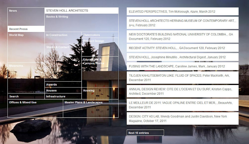
Steven Holl
An American architect and watercolorist, perhaps best known for the 1998 Kiasma Contemporary Art Museum in Helsinki, Finland, the 2003 Simmons Hall at MIT in Cambridge, Massachusetts, the celebrated 2007 Bloch Building addition to the Nelson-Atkins Museum of Art in Kansas City, Missouri, and the praised 2009 Linked Hybrid mixed-use complex in Beijing, China.


 This is the design on his website, I really like the blocks and visible grid with uneven columns and rows and the highlighted blocks which is selected. I think we could take this style and idea of boxes and blocks and experiement with this in the layout.
 I like how the box is overlayed on top of an image but is because it is white it is quite subtle and the image is still visible.

 A lot of the stuff I have looked at by Steven Holl seem to be blocks and squares/cubes and I think this could be a nice incormporation into the design for the eyarbook.


An American architect and watercolorist, perhaps best known for the 1998 Kiasma Contemporary Art Museum in Helsinki, Finland, the 2003 Simmons Hall at MIT in Cambridge, Massachusetts, the celebrated 2007 Bloch Building addition to the Nelson-Atkins Museum of Art in Kansas City, Missouri, and the praised 2009 Linked Hybrid mixed-use complex in Beijing, China.


Tuesday, 31 January 2012
Year book meeting 1
We had our first meeting today with Steve from Interior Design. We went with a list of quesitons and things we wanted to know.
Number of students
Images of students or not
Sections/chapters/pathways
We found out initial things we needed to know and also got some feedback from Steve things that he likes , both Graphic design and Interior design so that we could look into it and possibly influence our design.
We found out that he didn't like last years colour for the yearbook. Also last years was very thing with roughly 30 pages, we want to make it more substantial as this year is focusing on 3rd year only and last year was an overview of all 3 years and not really a year book about the students as such. Steve also mentinoed that this book is an advertisement of the course as well as a year book.


 We actually liked the colour but for copy inside it isn't really suitable but does make a unique, stand out cover. They've used this colour within the images as duotone images as well as black and white images. They have used a simple thin line throughout the layout which brings a clinical, clean style to it.
Number of students
Images of students or not
Sections/chapters/pathways
We found out initial things we needed to know and also got some feedback from Steve things that he likes , both Graphic design and Interior design so that we could look into it and possibly influence our design.
We found out that he didn't like last years colour for the yearbook. Also last years was very thing with roughly 30 pages, we want to make it more substantial as this year is focusing on 3rd year only and last year was an overview of all 3 years and not really a year book about the students as such. Steve also mentinoed that this book is an advertisement of the course as well as a year book.


Subscribe to:
Posts (Atom)