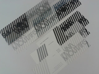
I created a set of three business cards which we talked about as Anna wanted three different cards for different areas, styling, cool hunting and sports fashion. I have used a consitency of the angle from the A and M and extended these as a pattern for the background but altered the shades of black for each.
The shade of the angled lines is then taken onto the back where the details of the discipline will be shown and also contact details.
I kept them as a strip to start with as I thought they could be perforated and folded up into a small booklet but then a lot of the information will be repeated on each card only the discipline will change so maybe they are best seperate or maybe she only needs one with all discipines on?
I then folded them so that they would fold into each other to create one flat card.
I tried a few different stocks, first of all just plain white card which I think works well but may want to try something thicker, I tried the accetate which I really like the look of but for double sided printing it wouldn't be practical unless all details were kept to one side. Still it might be too thin to work as a business card.
I tried similar stocks for the swing tickets but also tried tracing paper because I want to them to be layered and things to work ontop of each other and things to be seen through other stocks like her design practice I want to use layering.
These are the acetate one's which I think works well in the black, the black has come out quite strong on the accetate and so the name is striking.
I experimented with a plain matt stock as well and experimented with layering these different stocks ontop of each other to see what worked well. I don't think the tracing paper is strong enough for this and the colours didn't print as well as on accetate. I prefer the accetate designs but will have to keep experimenting to see
I think when together its apparent that the darkest shade of the black/grey I used is too dark and not so easy to read.


No comments:
Post a Comment