Friday, 27 April 2012

For/Against

I've been having difficulty with how to layout the publication and how to split it up to go with the concept I want of splitting. I was thinking of directly splitting it in half with for and against opinons on Margaret Thatcher however the more I've thought about it and researched there is not a split divide in opinion but a higher proportion of against.

These arent supposed to be upside down I will change them...


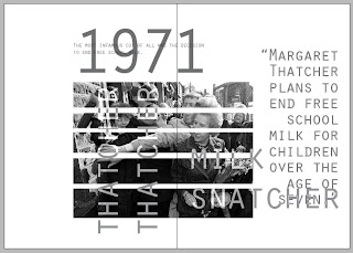
 I started to layout the pages and started with the election of Maragaret Thatcher as Prime Minister as this sets the scene and informs people of when her time began. I am keeping it all black/ white and grey to represent a newspaper but more of an experimental layout.
With each spread I have tried to 'split' all aspects including the images and the copy. I need to revisit them and experiment more to ensure they are all legible but for now I am experimenting with how to split the elements.


Wednesday, 25 April 2012

Publication

 I couldn't decide how to split my publication into for and against as it wouldn't be an equal split and so I couldn't just do half and half. I toyed with a few different ideas but thought this kind of idea would work best. So I am going to produce a smaller publication for and bind these together so they work together.


Edgeboard

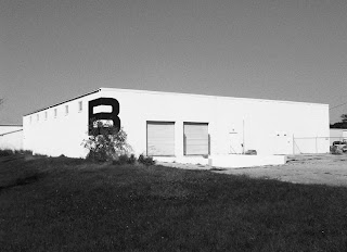
The identity is based on the board’s special feature, the edge, and the brand comes to life using the edge in any any application. A simple, structured logo is used in combination with textured and environmentally friendly stocks.

I really like the simplicity of the concept this is what I want to achieve in my work, simple, effective concepts that work so well.


I also like the monochrome colour palette, it brings a sense of style and quality to the brand.

Sunday, 22 April 2012

Interior Design- studio photos

These are a selection of the photos that we took, we took out a wide angled lense to capture the space. These are the best images we mamanged to get of the students in their environment and with the tutors. We're not sure yet which ones we want to use or how many but it allows to have options.


Year book- photographs and type

 With the photos that we took of the Interior Design studio I want to include full bleed images with copy over the text for the showcase page I think it would be a nice introduction into the student profiles.

Coast- Fashion publications


Design Context Presentation 2

I have narrowed down my publication to just focus on fashion. I want to look within this at disciplines which are of most interest to me like branding/identity, publication and also do a case study on how the concept of the fashion design and the garments is transferred into the graphic design.

Friday, 20 April 2012

Exhibition Guide

 This is the cover and how the guide would fold up. I think it is possibly too small for an exhibition guide but will have to get people to test it for it's legibility and how you would handle it.
This is how the guide folds out on the back, I like how the black has printed on the stock it looks strong and stands out.

 This is the front side of the guide. I am concerned about how it folds together, because it is quite small and there are a lot of folds it may be too thick when folded in. I also need to improved on the folds as some of the scoring is visible.


Thursday, 19 April 2012

Badges

As part of the merchandise which would be in the shop at the exhibition I want to include little pin badges as I think this is appropriate for the audience, a lot of music fans own badges suppoting a band or style of music. I've also been thinking about plectrums as this is appropriate to the subject matter and audience.

I know somebody who can make me some pin badges, I only want a few to show a few different designs and how they would make up part of the exhibiton range.


Designs


End of Year Show- previous designs


This waas last years winner, we really like the photogrpahy aspect of it and involving students and want to use this style for our pitch but have students emerging from soil and dusting it off them.


 This design was the year before last, I like the tag line 'fresh out of the box' we need to come up with something which is relevant to our concept and which people are familiar with, a phrase or saying.