Wednesday, 30 May 2012

End of Module Evaluation OUGD303


Evaluation
OUGD303
FMP
Sophie Herring

My beginning rationale statement was ‘branding an identity for the culture and retail sectors, reinforced through the use of type and layout.’ At the end of the module I still stick by this statement and think my design interests have been consistent throughout. Most of my briefs fulfilled this statement and I found that I enjoyed working on these more than just he publication briefs because I like to create a range and design for other elements to create an atmosphere for a brand.
I definitely work predominantly with type and layout and this is always a considered largely within my designs. This is a conscious design within my work and as I stated in my SOI I would stay away from image. However, within my sixth brief, the film festival I found myself with the relationship between type and image but not creating my own image, using existing photographs.  I am a lot more confident working with type and layout and feel like I have practised my skills in this area throughout the module within all briefs.

In my statement of intent I suggested that I would predominantly print based but consider design for web also. I think I have stuck to this part of the statement as within almost every brief as well as the printed, physical deliverables I have considered design for web and also design for large scale and interior so that a better picture of how a brand would work is created. Designing for web is something I want to continue with and inform myself more and more in with regards to actually creating the web presence because I am aware of its importance.

The Year book brief was more difficult than I anticipated. Although working as a group of four meant we shared the work load it did cause some issues with communication and decision making. I wanted to work on a number of live briefs to work to a client’s needs but working with so many clients (the interior students) proved a lot more difficult with regards to gaining content from them as some were more willing to co-operate more than others.

My statement of intent stated that I wanted to design for retail sector which I found myself most interested in with the fashion branding brief. I definitely found that I enjoyed this brief a lot and maybe spent more time than I needed on it. I definitely have realised that my interests lie within identity and how this can be explored and taken across to promotional material. I think these two disciplines have become my main area of focus.

I struggled to get into the Film brief at first because I didn’t have a focus but once I gave it a concept and a focus I developed the brief. I am annoyed that it took me so long to do this as the outcome has been a bit rushed but this brief reinforces my statement of ‘I want the basis of all my design work to stem from a distinct concept and for this drive the design but for the aesthetic quality to be of equal importance.’ With this in mind it has become apparent to me that coming up with a concept and keeping this in mind with all aspects of the design is important and I want to continue with this rather than just creating aesthetically pleasing work, I want there to always be a reason for doing something.
I am glad that by the time I reached this module I had found where my interests lie and was able to explore this. I don’t think my interest has changed throughout the module and I am still keen to design for the culture and retail sectors reinforcing this through type and layout.

I have definitely not kept on top of my blog as much as I have could have and regret getting carried away with design and not documenting everything as I go. This is down to poor time management and organisation and prioritisation. I definitely feel that I have not produced enough work for brief 4 and think this is because as the module went on I found that I was more interested in the identity and promotion briefs and this brief didn’t really have a purpose but was more personal.
I am pleased with some of the work I have created during this module and am happy that it reflects me as a designer and where my interests in design lie and my portfolio will now hopefully have a consistency of my design interests. 

Boards

Brief 1


Brief 3

Brief 4


Brief 6


Brief7

Monday, 14 May 2012

123 Buero


I really like the layout for the look book, I like how some images overlay the background and they aren't a set size they vary. I also like how there is a contrasting background on the above image I'd like to use this with different tints of grey for Anna's.


Thursday, 10 May 2012

Labels

 Anna has sewn her labels onto her garments now so I can see them in context, for my photos at the end I want to be able to incorporate one of her garments to show the range. I think the white was a good decision because it contrasts well against the black.


Look book covers


 For the look book covers I tried out a few dififerent ideas and different stocks. I like this cover which is a grey acetate with the logo, brand name and Spring Summer collection and behind this is a full bleed of one of Anna's grey print.
 Another design I did was strips of the grey pattern on tracing paper with a grey mat behind it with the logo and brand name behind so this shows through subtly. I like the idea of incorporating Anna's print into the cover somehow and using layering within this with different stocks. I prefer the acetate cover but am worried about binding this on the cover I don't want it to look untidy.


Silent Film Festival-invite

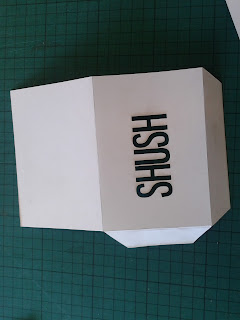
I want to keep everything minimal and white with limited type to focus on the silent part of the film festival. For the invites I wanted to carry this through so that it isn't very obvious when it is first seen what it is but it folds out to reveal more.
 I have laser cut the festival name into the fron of the card which folds up to form an envelope, this allows the actual invite to be slotted inside of the evelope.


 The only thing which is a drawback to the lasercutting is the marks i leaves behind especially because I want it all to look white and crisp but I tried to erase them as much as possible.

Mini fold out

I wanted to get the format sorted for the mini fold out so as I'm still waiting on the photos because Anna's photoshoot isn't until next week so I have used existing images to work out how it would look.


 I think the cover doesn't stand out enough being white, I might try using the pattern of diagnol stripes or using a dark grey so that it stands out more.


Mini fold out

Anna and I discussed the option of having an additional document to work alongside her look book which just has the main outfits with the flat designs and prices on.

I wanted to create something small so that it is differentiated from the look book and at the show will be something that people want to pick up.

I have been looking at folds and fold out documents. There will be six outfits and six lots of flats so the folds need to be big enough to showcase these images well enough. It needs a front cover also to introduce what the little fold out is and who the designer is.


Mock up

We combined our designs together to create an up to date mock up of where we are with the year book. There are still images missing from two students and also some other information throughout.


We want the cover to be embossed so it is subtle and reflects the sustainable nature of the course

My spreads


 Some of the image sizes were more difficult to work with to fit them into the layout we had agreed on and the grid. Some images were long and thin which look good because they are different but I have scaled them down so they fit on a single page, I may revisit them because I did try them across the double page spread but then this left little room for other imagery.
 These are the spreads I have been working on, we allocated a set number of spreads to work on each in the group so we can then bring them together.
 We haven't recieved all imagery for the model making and technical drawing page so I just made a start, I really like the imagery we have for this I think it represnts the cours well and shows the detail of their work.

Prospectus Pitch

These are the final boards for the pitch, we each had our input on different areas of the designs and this came together to create the complete pitch.

I put these boards together to show our context reseach and the idea then going into the design and then showing how this can be explanded onto additional deliverables.


Hand out

I designed a hand out to give to the members of the team we are pitching to so they have some visuals of what we are talking about to have for themselves and take a closer look at the main points of our idea.

We wanted to keep it simple and I thought it would be best to reflect the format of the prospectus we are pitching in the handout. So I created a fold out hand out with the cover cut like we were proposing for the prospectus.


We personalised each hand out to the memebers of the board with their names.